An internet resource developed by
Christopher D. Green
York University, Toronto, Ontario
ISSN 1492-3173
(Return to index)
STATISTICAL METHODS FOR RESEARCH WORKERS
By Ronald A. Fisher (1925)
Posted March 2000
II
DIAGRAMS
7. The preliminary examination of most data is facilitated by the use of diagrams. Diagrams prove nothing, but bring outstanding features readily to the eye; they are therefore no substitute for such critical tests as may be applied to the data, but are valuable in suggesting such tests, and in explaining the conclusions founded upon them.
8. Time Diagrams, Growth Rate and Relative Growth Rate
The type of diagram in most frequent use consists in plotting the values of a variable, such as the weight of an animal or of a sample of plants against its age, or the size of a population at successive intervals of time. Distinction should be drawn between those cases in which the same group of animals, as in a feeding experiment, is weighed at successive intervals of time, and the cases, more characteristic of plant physiology, in which the same individuals cannot be used twice, but a parallel sample is taken at each age. The same. distinction occurs in counts of micro-organisms [p. 28] between cases in which counts are made from samples of the same culture, or from samples of parallel cultures. If it is of importance to obtain the general form of the growth curve, the second method has the advantage that any deviation from the expected curve may be confirmed from independent evidence at the next measurement, whereas using the same material no such independent confirmation is obtainable. On the other hand, if interest centres on the growth rate, there is an advantage in using the same material, for only so are actual increases in weight measurable. Both aspects of the difficulty can be got over only by replicating the observations; by carrying out measurements on a number of animals under parallel treatment it is possible to test, from the individual weights, though not from the means, whether their growth curve corresponds with an assigned theoretical course of development, or differs significantly from it or from a series differently tested. Equally, if a number of plants from each sample are weighed individually, growth -rates may be obtained with known probable errors, and so may be used for critical comparisons. Care should of course be taken that each is strictly a random sample.
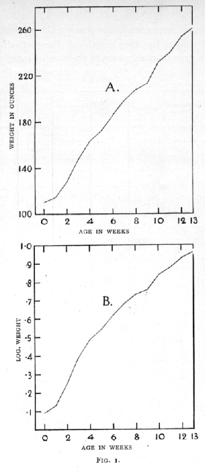
Fig. 1 represents the growth of a baby weighed to the nearest ounce at weekly intervals from birth. Table 1 indicates the calculation from these data of the absolute growth rate in ounces per day and the relative growth rate per day. The absolute growth rates, representing the average actual rates at which substance is added during each period, are found by [p. 29] [figure] [p. 30] subtracting from each value that previously recorded, and dividing by the length of the period. The relative growth rates measure the rate of increase not only per unit of time, but per unit of weight already attained; using the mathematical fact, that
![]() [p. 31]
[p. 31]
it is seen that the true average value of the relative growth rate for any period is obtained from the natural logarithms of the successive weights, just as the actual rates of increase are from the weights themselves. Such relative rates of increase are conveniently multiplied by 100, and therefore expressed as the percentage rate of increase per day. If these percentage rates of increase had been calculated on the principle of simple interest, by dividing the actual increase by the weight at the beginning of the period, somewhat higher values would have been obtained; the reason for this is that the actual weight of the baby at any time during each period is usually somewhat higher than its weight at the beginning. The error introduced by the simple interest formula becomes exceedingly great when the percentage increases between successive weighings are large.
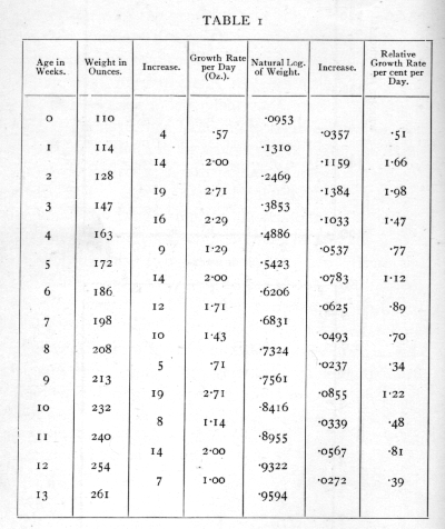
Fig. 1A shows the course of the increase in absolute weight ; the average slope of such a diagram shows the absolute rate of increase. In this diagram the points fall approximately on a straight line, showing that the absolute rate of increase was nearly constant at about 1.66 oz. per diem. Fig. 1B shows the course of the increase in the natural logarithm of the weight; the slope at any point shows the relative rate of increase, which, apart from the first week, falls off perceptibly with increasing age. The features of such curves are best brought out if the scales of the two axes are so chosen that the line makes approximately equal angles with the two axes; with nearly vertical, or nearly horizontal lines, changes in the slope are not so readily perceived. [p. 32]
A rapid and convenient way of displaying the line of increase of the logarithm is afforded by the use of graph paper in which the horizontal rulings are spaced on a logarithmic scale, with the actual values indicated in the margin. The horizontal scale can then be adjusted to give the line an appropriate slope. This method avoids the use of a logarithm table, which, however, will still be required if the values of the relative rate of increase are needed.
In making a rough examination of the agreement of the observations with any law of increase, it is desirable so to manipulate the variables that the law to be tested will be represented by a straight line. Thus Fig. 1A is suitable for a rough test of the law that the absolute rate of increase is constant ; if it were suggested that the relative rate of increase were constant, Fig. 1B would show clearly that this was not so. With other hypothetical growth curves other transformations may be used; for example, in the so-called "autocatalytic" curve the relative growth rate falls off in proportion to the actual weight attained at any time. If, therefore, the relative growth rate be plotted against the actual weight, the points should fall on a straight line if the "autocatalytic" curve fits the facts. For this purpose it is convenient to plot against each observed weight the mean of the two adjacent relative growth rates. To do this for the above data for the growth of an infant may be left as an exercise to the student; twelve points will be available for weights 114 to 254 ounces. The relative growth rates, even after averaging adjacent pairs, will be very irregular, [p. 33] so that no clear indications will be found from these data. If a straight line is found to fit the data, it should be produced to meet the horizontal axis to find the weight at which growth ceases.
9. Correlation Diagrams
Although most investigators make free use of diagrams in which an uncontrolled variable is plotted against the time, or against some controlled factor such as concentration of solution, or temperature, much more use might be made of correlation diagrams in which one uncontrolled factor is plotted against another. When this is done as a dot diagram, a number of dots are obtained each representing a single experiment, or pair of observations, and it is usually clear from such a diagram whether or not any close connexion exists between the variables. When the observations are few a dot diagram will often tell us whether or not it is worth while to accumulate observations of the same sort; the range and extent of our experience is visible at a &lance ; and associations may be revealed which are worth while following up.
If the observations are so numerous that the dots cannot be clearly distinguished, it is best to divide up the diagram into squares, recording the frequency in each; this semi-diagrammatic record is a correlation table.
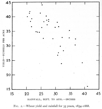
Fig. 2 shows in a dot diagram the yields obtained from an experimental plot of wheat (dunged plot, Broadbalk field, Rothamsted) in years with different [p. 34] total rainfall. The plot was under uniform treatment during the whole period 1854-1888; the 35 pairs of observations, indicated by 35 dots, show well the association of high yield with low rainfall. Even when few observations are available a dot diagram may suggest associations hitherto unsuspected, or what is equally important, the absence of associations which would have been confidently predicted. Their value lies in giving a simple conspectus of the experience hitherto gathered, and in bringing to the mind suggestions [p. 35] which may be susceptible of more exact statistical examination.
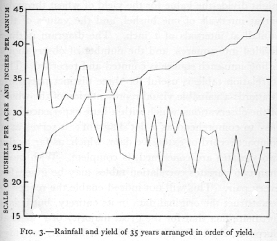
Instead of making a dot diagram the device is sometimes adopted of arranging the values of one variate in order of magnitude, and plotting the values of a second variate in the same order. If the line so obtained shows any perceptible slope, or general trend, the variates are taken to be associated. Fig. 3 represents the line obtained far rainfall, when the years are arranged in order of wheat yield. Such diagrams are usually far less informative than the diagram, and often conceal features of importance brought out by the-former. In addition the dot diagram possesses the advantage that it is easily used [p. 36] as a correlation table if the number of dots is small, and easily transformed into one if the number of dots is large.
In the correlation table the values of both variates are divided into classes, and the class intervals should be equal for all values of the same variate. Thus we might divide the value for the yield of wheat throughout at intervals of one bushel, and the values of the rainfall at intervals of 1 inch. The diagram is thus divided into squares, and the number of observations falling into each square is counted and recorded. The correlation table is useful for three distinct purposes. It affords a valuable visual representation of the whole of the observations, which with a little experience is as easy to comprehend as a dot diagram; it serves as a compact record of extensive data, which, as far as the two variates are concerned, is complete. With more than two variates correlation tables may be given for every pair. This will not indeed enable the reader to reconstruct the original data in its entirety, but it is a fortunate fact that for the great majority of statistical purposes, a set of such twofold distributions provides complete information. Original data involving more than two variates is most conveniently recorded for reference on cards, each case being given a separate card with the several variates entered in corresponding positions upon them. The publication of such complete data presents difficulties, but it is not yet sufficiently realised how much of the essential information can be presented in a compact form by means of correlation tables. The third feature of value about [p. 37] the correlation table is that the data so presented form a convenient basis for the immediate application of methods of statistical reduction. The most important statistics which the data provide can be most readily calculated from the correlation table. An example of a correlation table is shown in Table 31, p. 140.·
10. Frequency Diagrams
When a large number of individuals are measured in respect of physical dimensions, weight, colour, density, etc., it is possible to describe with some accuracy the population of which our experience may be regarded as a sample. By this means it may be possible to distinguish it from other populations differing in their genetic origin, or in environmental circumstances. Thus local races may be very different as populations, although individuals may overlap in all characters; or, under experimental conditions, the aggregate may show environmental effects, on size, death-rate, etc., which cannot be detected in the individual. A visible representation of a large number of measurements of any one feature is afforded by a frequency diagram. The feature measured is used as abscissa, or measurement along the horizontal axis, and as ordinates are set off vertically the frequencies, corresponding to each range.
Fig. 4 is a frequency diagram illustrating the distribution in stature of 1375 women (Pearson and Lee's data modified), The whole sample of women is divided up into successive height ranges of one inch. [p. 38] Equal areas on the diagram represent equal frequency; if the data be such that the ranges into which the individuals are subdivided are not equal, care should be taken to make the areas correspond to the observed frequencies, so that the area standing upon any interval of the base line shall represent the actual frequency observed in that interval.
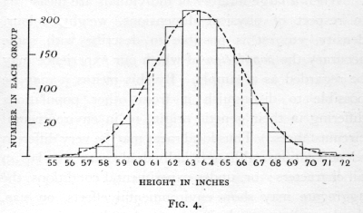
The class containing the greatest number of observations is technically known as the modal class. In Fig. 4 the modal class indicated is the class whose central value is 63 inches. When, as is very frequently the case, the variate varies continuously, so that all intermediate values are possible, the choice of the grouping interval and limits is arbitrary and will make a perceptible difference to the appearance of the diagram. Usually, however, the possible limits of grouping will be governed by the smallest units in which the measurements are recorded. If, for example, measurements of height were made to the nearest [p. 39] quarter of an inch, so that all values between 66-7/8 inches and 67-1/8 Were recorded as 67 inches, all values between 67-1/8 and 67-3/8 were recorded as 67-1/4, then we have no choice but to take as our unit of grouping 1, 2, 3, 4, etc., quarters of an inch, and the limits of each group must fall on some odd number of eighths of an inch. For purposes of calculation the smaller grouping units are more accurate, but for diagrammatic purposes coarser grouping is often preferable. Fig. 4 indicates a unit of grouping suitable in relation to the total range for a large sample ; with smaller samples a coarser grouping is usually necessary in order that sufficient observations may fall in each class.
In all cases where the variation is continuous the frequency diagram should be in the form of a histogram, rectangular areas standing on each grouping interval showing the frequency of observations in that interval. The alternative practice of indicating the frequency by a single ordinate raised from the centre of the interval is sometimes preferred, as giving to the diagram a form more closely resembling a continuous curve. The advantage is illusory, for not only is the form of the curve thus indicated somewhat misleading, but the utmost care should always be taken to distinguish the infinitely large hypothetical population from which our sample of observations is drawn, from the actual sample of observations which we possess; the conception of a continuous frequency curve is applicable only to the former, and in illustrating the latter no attempt should be made to slur over this distinction. [p. 40]
This consideration should in no way prevent a frequency curve fitted to the data, from being super-imposed upon the histogram (as in Fig. 4); the contrast between the histogram representing the sample, and the continuous curve representing an estimate of the form of the hypothetical population, is well brought out in such diagrams, and the eye is aided in detecting any serious discrepancy between the observations and the hypothesis. No eye observation of such diagrams, however experienced, is really capable of discriminating whether or not the observations differ from expectation by more than we should expect from the circumstances of random sampling. Accurate methods of making such tests will be developed in later chapters.
With discontinuous variation, when, for example, the variate is confined to whole numbers, the above reason for insisting on the histogram form has little weight, for there are, strictly speaking, no ranges of variation within each class. On the other hand, there is no question of a frequency curve in such cases. Representation of such data by means of a histogram is usual and not inconvenient; it is especially appropriate if we regard the discontinuous variation as due to an underlying continuous variate, which can, however, express itself only to the nearest whole number.
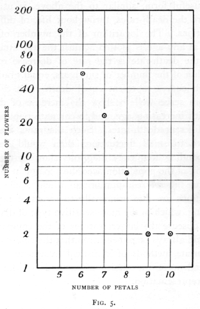
It is, of course, possible to treat the values of the frequency like any other variable, by plotting the value of its logarithm, or its actual value on logarithmic paper, when it is desired to illustrate the agreement [p. 41] of the observations with any particular law of frequency. Fig. 5 shows in this way. the number of flowers (buttercups) having 5 to 10 petals (Pearson's data), plotted upon logarithmic paper, to facilitate comparison with the hypothesis that the frequency, for petals above five, falls off in geometric progression. Such illustrations are not, properly speaking, frequency diagrams, although the frequency is one of the variables [p. 42] employed, because they do not adhere to the convention that equal frequencies are represented by equal areas.
A useful form, similar to the above, is used to compare the death-rates, throughout life, of different populations. The logarithm of the number of survivors at any age is plotted against the age attained. Since the death-rate is the rate of decrease of the logarithm of the number of survivors, equal gradients on such curves represent equal death-rates. They therefore serve well to show the increase of death-rate with increasing age, and to compare populations with different death-rates. Such diagrams are less sensitive to small fluctuations than would be the corresponding frequency diagrams showing the distribution of the population according to age at death; they are therefore appropriate when such small fluctuations are due principally to errors of random sampling, which in the more sensitive type of diagram might obscure the larger features of the comparison. It should always be remembered that the choice of the appropriate methods of statistical treatment is quite independent of the choice of methods of diagrammatic representation.